 PHIL SIMON
I love sports and have since I was a kid. Back then, I would religiously look at box scores and at the backs of baseball cards to see who was good at what. I didn’t really create graphs or data visualizations until college.
Today, there’s no shortage of tools to visualize data and create interactive tools. It’s a key point in The Visual Organization. Sure, static bar and pie charts often get the job done on simple tasks, but they don’t promote data discovery to the same extent that their interactive counterparts do. By and large, these new tools are portable (read: device-agnostic) and incredibly user friendly, both of which are imperative in an era of mobility and BYOD.
For instance, I’ve been playing around with Datawrapper, a neat free and open-source tool for visualizing data. I grabbed some data from BasketballReference on Miami Heat shooting guard Ray Allen.
Static box scores seem so 1998.
It’s interesting to see how Allen’s minutes played (MP) and, by extension, field goal attempts (FGA) have varied over the years. Although his minutes have declined as of late, his shooting percentage has not. The man is remarkably consistent.
You Need Not Be a Programmer
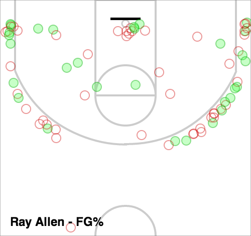
Creating the interactive dataviz above just took a few minutes. To be sure, it is interesting on some level, but it doesn’t answer the question Where does Allen most often shoot? For that, we can go to Vorped.
Simon Says
I can geek out all day here but you get my point: There have never been more ways to ask questions of our data. To boot, it’s never been more important to do so. Even single-purpose bar and column charts can be integrated into more holistic views of statistics.


Shot charts are my favorite among the visualization tools for NBA stats. Most of the others don’t reveal much that’s new to me, but to see where on the floor a team, or player, is scoring is something that can’t be better represented any other way than showing the floor.
That said: there is a problem with that Vorped chart. It doesn’t include a key – is this from the last week? The last month? The last season? All time? It doesn’t say, and the chart should be self contained in this regard.
From playing with Vorped’s chart on this it looks like you took the default, which is the last 30 days. If you select the entire 2013 season, you get a very different chart. (And sadly they don’t have lifetime stats for this which would have been the most interesting of all, as earlier in his career he was less of a 3-pt specialist)
I’d also say box scores are easy to skim and don’t take up much space. Visualizations generally decrease information density in favor of exposing other kinds of relationships – this is good, but the fact that boxscores are old doesn’t necessarily mean they are bad. If you want a quick summary of the how every player played, and therefore a summary of why one team one or lost, there’s nothing faster.
Agreed. Box scores are good for the basics. Ideally, having both the raw data and a cool way to visualize it makes for better decisions. I can’t imagine trying to manage by box score alone.