 PHIL SIMON
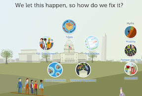 When people ask me what I write about, I tell them that I focus on the intersection of people, technology, business, and data. It’s a short, accurate, and (I hope) intriguing description of my work.
The Visual Organization explores Big Data and data visualization in business contexts. That hardly means, though, that there aren’t myriad non-commercial uses for dataviz. Far from it. As I write in the book, we’ve not only seen the rise of visual organizations. Visual consumers, visual citizens, visual journalists, and visual governments have also arrived in full force. In short, ours is a much more visual and data-oriented world than even five years ago. The same will be said in five years.
Data and dataviz can tell powerful stories and inspire citizens to take action.
Democratizing forces like the Internet, open data, cloud computing, the ever-declining cost of data storage, greater transparency, and mobility are making it easier than ever for laypeople to visually represent just about everything, including thorny societal problems.
This begs the question, Why visualize? For starters, it’s tough to address certain problems if they aren’t entirely understood. And, more than ever, organizations of all types are pulling out the data and dataviz clubs from their bags. The reason: Data lets them tell powerful stories and inspire people to take action.
Example
For instance, consider income inequality, a topic of President Obama’s January State of the Union Address. Now, you may not believe that the current distribution of wealth is a problem. Maybe, like legendary venture capitalist Tom Perkins, you think that the rich are being persecuted in this country. If that’s the case, then it’s unlikely that anyone or anything is going to convince you otherwise.
But if you do, you might want to use data to make your case. And that’s exactly what socially conscious data-visualization firm Periscopic did. The company created Inequality.is for the Economic Policy Institute, a left-leaning think tank based in Washington, DC. (Interesting side note: I attended a lecture at EPI more than 20 years ago.) EPI wants to demonstrate the gap between the rich and poor–and why this gap is a problem. Beyond raising awareness, EPI wants people to take action. EPI knows that data and data visualizations represent viable means to this end.
Simon Says
No dataviz can solve all of the world’s problems or build consensus among warring factions. That day may never come. Still, today dataviz is no longer the exclusive purview of the private sector. On the contrary, citizens, journalists, and government agencies are increasingly using data and data visualizations to make their cases and advance their agendas.
![]() I wrote this post as part of the IBM for Midsize Business program.
I wrote this post as part of the IBM for Midsize Business program.


0 Comments