 PHIL SIMON
 Phil Simon
When asked about his refusal to make a formal political endorsement in a Senate race, Michael Jordan famously said “Republicans buy shoes too.” It’s a great quote, although prominent black athletes like Jim Brown were none too pleased at Jordan’s apolitical stance given his stature.
Today, simple pie charts and spreadsheets can’t tell the same stories that interactive data visualizations can.
I intentionally avoid overtly political discussions on my blog and in my talks. Sure, I have my own beliefs, but my clients don’t hire me to wax philosophical on the way the body politic ought to operate.
Bring Data or Go Home
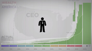
Regardless of your political leanings, though, it’s never been easier and arguably more important to convey those beliefs via effect data visualizations. (For more, see Data and Politics.) In this vein, the pseudonymous filmmaker Politizane created the amazing video below that displays income inequality in the U.S. Given the subject and the quality of the video, it’s no surprise that it went viral with more than 15 million views as of this writing.
I won’t open up Pandora’s box here, but it’s hard to watch this video and not feel something. Simply put, a basic spreadsheet cannot evoke the same emotions as a compelling data visualization.


0 Comments