 PHIL SIMON
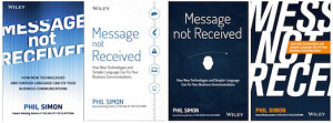
I’m about 37,000 words into the manuscript for Message Not Received. The research is going very well. I’ve already nailed down a few case studies, but there’s room for one or two more.
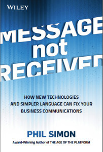
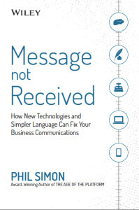
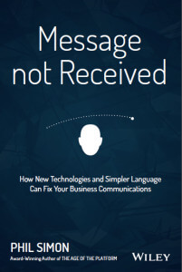
One of my favorite parts of the book-writing process is the development of the cover. For several reasons, it’s a blast. For one, it’s just plain fun to see my ideas become more tangible. I’ll typically throw out a few concepts to Luke Fletcher, my awesome cover guy and, over the course of a 45-minute phone call, we’ll flush them out. A few weeks later, he’ll return with several mockups that reflect the gist of our discussion. We refine them from here.
It doesn’t hurt that Luke and I have a great rapport. Like me, he’s a huge fan of Breaking Bad and The Big Lebowski, although these common interests make it too easy for us to get off track. They were Nazis, dude?
Here are some mockups from Luke:
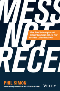


Hi Phil, I like the first and the fourth cover page.
Small tweaks I’d suggest,
First cover page:
The title looks classy in that box, showing lines in shape of an envelop may indicate it is a message.
Last cover page: The text “Message not Received” can be shown in a small envelop shaped box, somewhere below so that the title is completely visible.
I voted for number two, but also like three. Good luck!!