 PHIL SIMON
 By now, most intelligent business professionals accept the fact that Big Data and dataviz have arrived in earnest. To quell any remaining doubt regarding the form, consider the recent words of a Gartner analyst: “Hype is now being replaced by practicality.”
Of course, that doesn’t mean that everyone in an organization can and even should start setting up Hadoop clusters and learning Python. As I write in The Visual Organization, data visualization has become essential to not only understand what is happening, but to act on it.
Development Details
Developing an intelligent dataviz certainly requires some forethought. One should not sit down to create a data visualization in isolation. Think about it. An architect would never draw elaborate blueprints and start building without consulting their clients. The lifestyle and needs of a relatively young family of four often contradict those of seventy-something retirees. By the same token, data-visualization experts and practitioners know that when building tools one size rarely fits all. Complicating matters further, there’s never been a greater variety of tools available for developers.
This begs the question, how should developers design data visualizations that will be useful for different audiences? In this post, I’ll describe the major types of business audiences that typically interact with developers. I’ll also provide some tips on how to effectively design and develop dataviz tools for important groups of business users.
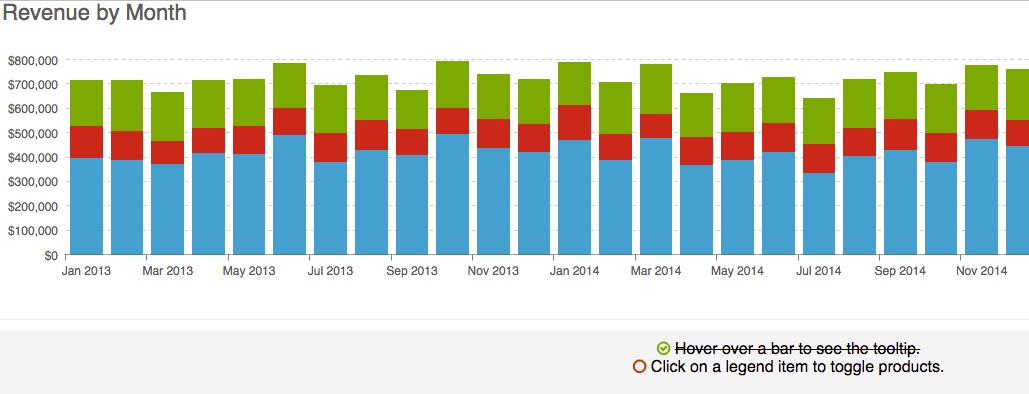
Interactivity should be the rule, not the exception.
- Executives and business users. As I know all too well, these non-technical folks are the antithesis of conventional “techies.” Many even are dataphobes. To this end, it’s imperative to ask them high-level questions and ensure that they are being clear with their requirements. Often, because of their backgrounds, the greatest challenge for developers lay in communication and ensuring that business users and developers use a common technical and dataviz vocabulary. Using one set of terminology can help ensure that visualizations address most key data-related questions.
- Product and project managers. Unlike the top brass and the 30,000-foot crowd, these folks often try to solve very specific problems and address specific issues. What does this mean for dataviz? It behooves developers to work with these groups to select a charting library that will meet their short- and long-term visualization needs. Is the selected tool flexible enough to work with current requirements? What about anticipating future ones?
- Data scientists. Developers would do well here to err on the side of flexibility and size (re: Big Data). A great deal of data science hinges upon exploration and data discovery. That is, true data scientists will follow the data wherever it goes. At the same time, though, they don’t know where the data will take them. As a result, developers who create a tool that lets data scientists get hands-on
- Software developers. Generally speaking, developers are quite the technical bunch. They can “go deep” with different concepts and despise rework—especially when it can be avoided. Build with the understanding that further integration with different application programming interfaces (APIs) is not only possible. It’s expected and easily accomplished compared to prior years.
To be sure, these audiences differ on many levels: their needs, backgrounds, levels of technical proficiency, and the like. Still, it’s not hard to find a commonality or two among them; in other words, it’s wise to build a tool that can provide a number of different views of the data. For starters, it’s best for dataviz developers to build for interactivity:
Click here for more.
Simon Says: Interactivity with data visualizations should be the rule, not the exception.
These days it’s not very hard for skilled developers to make even simple, stacked column charts interactive and embeddable. This way, their audiences can use a single dataviz to ask and answer a number of questions. Put differently, as intelligent folks and firms have started to realize, interactivity with data visualizations should be the rule today, not the exception.
 This post is brought to you by ZingChart’s JavaScript charting library. The opinions expressed here are my own. The ZingChart folks love charts. Feel free to hit them up for your dataviz project.


0 Comments