 PHIL SIMON
 I recently received my student evaluations from the summer and dutifully updated my interactive Tableau dataviz. In this post, I’ll discuss what the data tells me about my teaching style and methods. (Note that you can mouse over each image below to enlarge it.)
I’m rapidly improving at teaching
This is the most obvious finding. To be fair, though, I didn’t exactly hit the ball out of the park during my first semester. With any new job, there’s always a learning curve. Beyond that, ASU threw me three classes when I started. I suspect that my first evals would have been higher had I taught one or even two.
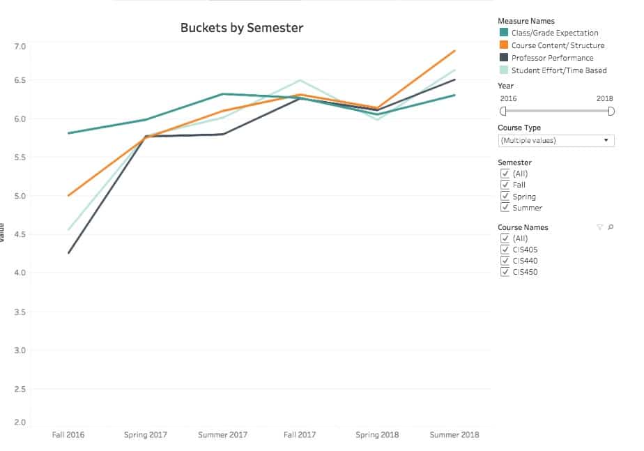
I can think of many changes that I’ve made in the last two years. Perhaps most significantly, I’ve replaced many lectures with exercises designed to promote active learning. It’s a big component of my teaching philosophy.
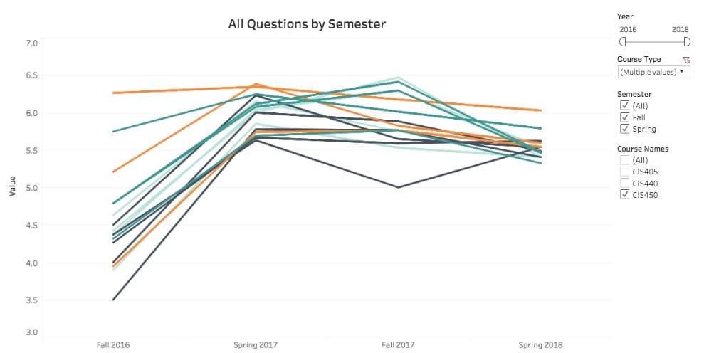
Students in the analytics capstone course are tougher to please than those in the system design one
While my ratings for the latter are routinely in the 6.6/7.0 ballpark, my numbers in the analytics course are about one point lower. Here are my scores for CIS450—the analytics capstone course:
Here are my comparable scores for CIS440—the system-design capstone course: 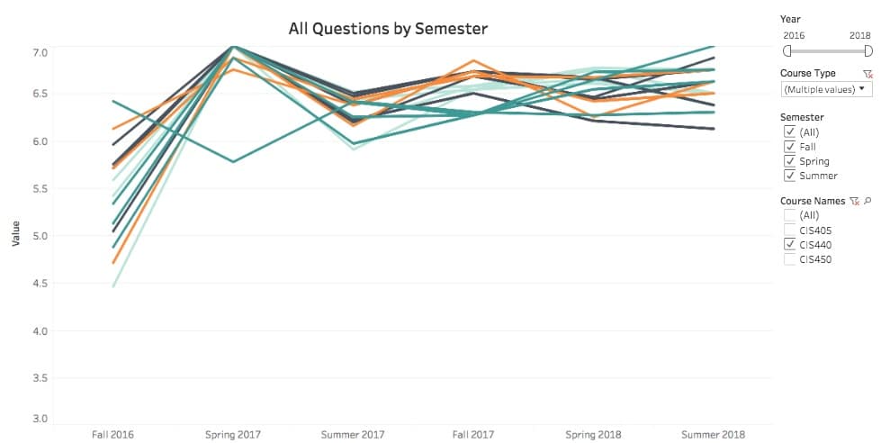
I’ve developed a working two-part theory on this that warrants a separate post one day. For now, I’ll just say a few things. First, I suspect that many students expect something fundamentally different from an analytics capstone course. This holds true despite my and the department’s attempts to provide truth in advertising. I even wrote Analytics: The Agile Way because I could not find a suitable textbook for the course.
 Second, a good number of my analytics students dislike the extent to which I emphasize clear writing on their individual research projects. Sure, I offer plenty of tips and personal feedback. Still, many of them cannot write in a way that effectively communicates their ideas.
For my part, I’m glad to take the hit here. That is, if my evaluations suffer as a result of my insistence that they write clearly, then so be it. I’d rather irritate a few students and force them to really think about what they’re writing and how. Students who can make sense out of vast troves of data and communicate that message to laypersons are firing on all cylinders. Those who don’t are really shooting themselves in the foot—whether they realize it or not .
Many students expect something fundamentally different from an analytics capstone course.
At the risk of getting all “statsy”, I’d bet that the data for CIS450 exhibits a bimodal distribution. In fact, the standard deviation of the dataset supports this hypothesis. (It’s about 2.5 per question for CIS450 vs. less than half of that for CIS440.) In other words, many students enjoy the analytics course while others are disappointed. With CIS440, there’s more more unanimity. Because of the anonymity of the data, however, I can’t prove this. (More on this later.)
Compared to in-person classes, it is harder to teach online ones
Heather E. Duncan and Suzanne Young demonstrated ![]() that, for most professors, there’s about a one-point ratings gap between the former and the latter. I was curious about my own numbers so I ran broke them down. Here’s a chart reflecting my studnet evaluations for in-person classes:
that, for most professors, there’s about a one-point ratings gap between the former and the latter. I was curious about my own numbers so I ran broke them down. Here’s a chart reflecting my studnet evaluations for in-person classes:
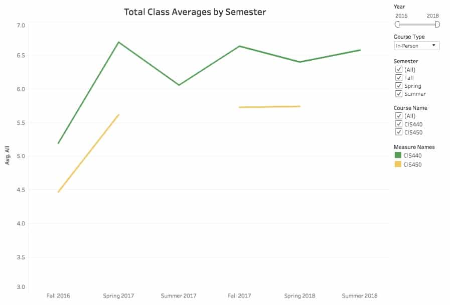
Here’s the breakdown for online classes: 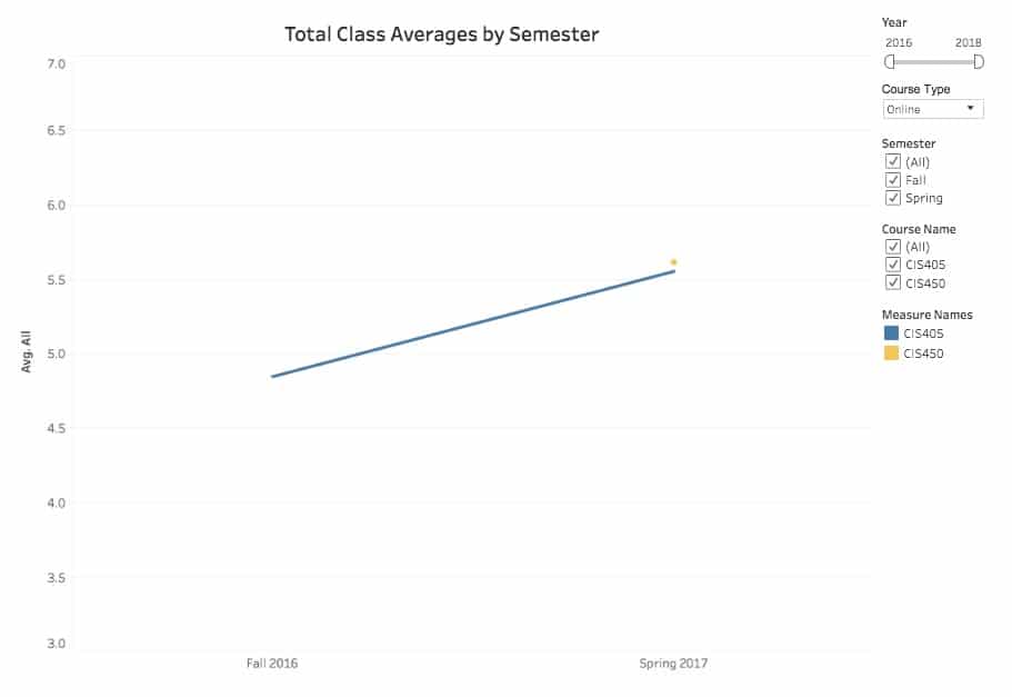
I’m a big proponent of using new tools such as Slack in the classroom. Try as I might with online students, though, the data is clear: I just don’t seem to offer the same level of support to them as I can with in-person students. Perhaps it’s just a limitation of the medium. I suspect that many professors would agree with me here.
Outliers really affect averages
I tell my students that, today more than ever, it’s essential for everyone to view data with a critical eye. I’m certainly not exempt from this rule.
Student-response rates are nowhere near 100 percent—a common problem in academia. This is important to keep in mind as the effects on average scores can be significant.
Consider a 22-student class with a 50-percent response rate. If everyone is relatively satisfied with the course and my performance, then my ratings reflect that number (scenario #1). Notice, however, how much even two disgruntled pupils can affect the average score (scenario #2). Stat-heads are right to point out that looking at median scores would overcome this limitation. Lamentably, ASU only provides its professors with aggregate data.

In the past, several students had axes to grind with me for different reasons. (Show me a professor who hasn’t.) I’d bet my house that those students gleefully filled out their evaluations and slammed me on Rate My Professor—not that I would ever know.
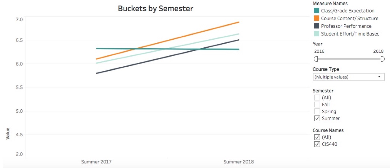
My summer evals have improved from 2017 to 2018
It’s tough to know the cause here. In other words, did I do better or did students care more? I definitely detected a tad of insouciance with my summer ’17 with my class. Thankfully, that wasn’t the case this past summer.
What I’d like to know about my student evaluations
 Student evaluations are anonymous. As such, I don’t know if Jerry found me engaging but Elaine considers me boring. I also cannot determine how cohorts of students break down. I can’t tell you if male or female students view me in the same manner. Ditto for American vs. international students or freshman vs. sophomores. Looking at student majors would also be interesting, as many of my students double majo
I am a curious sort, so I am just getting started here. I’ve got no shortage of queries.
How do my students perform in higher-level courses?
Are tenured professors better than their non-tenured ilk? David Figlio, Morton Schapiro, and Kevin Soter discovered that college students who take introductory classes with non-tenured professors received higher grades in more advanced classes in that subject. I’d love know if this is true with my students.
Miscellaneous queries
I’d like to see individual responses—even if names, genders, ages, and ethnicities didn’t appear. I’d like to know how my average scores break down. For instance, if my rating for a course is a 5.5 out of 7, do half of my students rate me a 6.5 while the other rate me a 4.5?
I would like to know how I rate in comparison to my peers. Am I any better or worse? Am I average? How can I possibly know this? Is it common for a first-time teacher to improve as much? What about others who have taught my classes? Or some classes easier to teach than others?
Next up, how much are my students learning? Is there any correlation between knowledge gained and my evaluations? I’d argue that the former supersedes the latter.
Finally, I love to know if student ratings correlate with grades. That is, is there a positive relationship between the two variables? I care about this on an individual level as well as a department-wide one.
Simon Says: Learn from your data.
 Limitations aside, I find that I can learn a great deal by looking carefully into the numbers. No, as I hope that I’ve shown above, they may not tell the whole story. (Insert obligatory Mark Twain quote.) Still, foolish are the souls who ignore the trends in their data.


0 Comments