 Back in November, I completed my switch to a WordPress site and my only complaint is that I waited so long. I have become a bit of WordPress nut over the last few months, obsessed with different tweaks, plug-ins, and widgets. It can be very addicting.
It’s not all roses, though. At least for me, the problem with having so many website options parallels “white board” software development. More often than not, I’d argue that in both cases there are major benefits to restrictions and parameters. Take away practical limitations, and it’s almost hard to decide on what to do, how to do it, and where to put it. And this is with a committee of one (me). Imagine a team of five people, even with relatively similar viewpoints. Can someone say “creative differences”?
Too Many Options
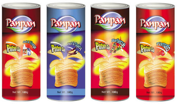
I’m hardly the first to write this, but colors, font sizes, layouts, column widths, and the like are quite important on web sites. A recent post by Jim Connolly does a great job of explaining why these things matter so much. Connolly cites the benefits of the Headway WordPress theme, and I’ll admit that it does look pretty cool. Still, I shudder to think about being able to easily alter anything and everything. It’s akin to going to the supermarket and having to decide among 50 different types of potato chips or orange juice.
Remember that most people don’t like having to figure out where everything is upon revisiting your site. Facebook’s redesigns have met with, at best, mixed results.
Simon Says
My primary complaint with many websites is that they’re too busy. I won’t call out any by name here, but we’ve all seen them. When compared with particularly chaotic sites, give me simplicity any day of the week and twice on Sunday.
But there is such a thing as “too simple.” I know of sites that lack core functionality expected and even required these days, such as search bars. Yes, I know that I can use Google to search within a site. It’s sad when I have to resort to that, though. Adding a search widget or snippet of code isn’t terribly hard and, to be sure, the squeeze is worth the juice.
Also, as Connolly points out in his post, you’ll never make everyone happy. Don’t try. I’d argue that the best sites use their real estate wisely and don’t constantly make major changes to layouts. As for truly innovative layouts and designs, they’re few and far between.
Where do you stand on the trade-off between simplicity and busyness? Which parts of sites these days are essential and which are annoying? Are you an tinkerer like me?
 PHIL SIMON
 Phil Simon


Hey Phil… I totally agree it is always a fine balance between form and function. I do think there is a case to make that too much function can have a direct negative affect on both form and more importantly function itself. I’m always reminded of the quote about making applications more complex… it goes something along the lines of. “Whoever heard of anyone complaining that an application is not complex enough?”
The ability to provide an interface that is feature rich yet still simple I have learnt is an art form…. To do it well you need to be incredibly talented (or lucky) and even then the outcome of the result is often a matter of taste.
Keep on dabbling!!
Amen! One of the things I really like about the mobile space is that the screen real estate constraints make it almost impossible to get too busy — if you go one step too far, all of a sudden your site/app is completely unusable. This forces you to focus on the core elements of your site, resulting in a better user experience.
Thanks, guys. Paul – I completely agree that simplicity is an art. I never thought about Andrew’s point but it makes complete sense.