

Student Evaluations
How a non-representative sample of ASU students viewed my performance as a professor.
ASU provides its professors with evaluation data in a raw format. That is, the data doesn’t lend itself to interactivity.
I decided to change that.
A few of my rock-star analytics students created a neat set of data visualizations under my supervision. This allows me to see how I am doing across a number of dimensions: class, semester, year, etc. I can easily see areas of strength and opportunities for improvement.
Notes
My feelings on student evaluations are decidedly mixed. My primary objection stems from Goodhart’s Law. Sure, I’m happy with the trends in my evaluations, but being an effective professor entails more than kowtowing to students and making them happy. Handing out A’s might help my evals but students who don’t learn how to think critically ultimately suffer.
Next, there’s anything but unanimity about the effectiveness of student evaluations. There’s strong evidence that student responses to questions of effectiveness do not measure teaching effectiveness. One of my colleagues believes that student evaluations offer little if any value to universities.
On a more technical level, the default view below contains both in-person and on-line courses—although you can filter in whatever way you like. As Suzanne Young and Heather E. Duncan have demonstrated for most professors there’s about a one-point ratings gap between the former and the latter. That is, students consistently rank online professors lower than their face-to-face (F2F) counterparts. I suspect that this is just a limitation of online courses.
Student evaluations take place in a vacuum. That is, I can’t see how student view my performance as a professor in relation to my peers. I strongly suspect, though, that I compare favorably to my colleagues. See the Slack poll on the right for more here.
Finally, the data visualization looks best on a desktop or laptop. You can view it on a tablet but there’s just too much data to see it all.
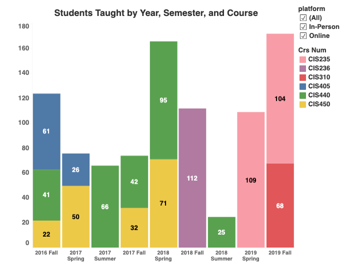
Sample Visualizations
Click on an image to enlarge it.
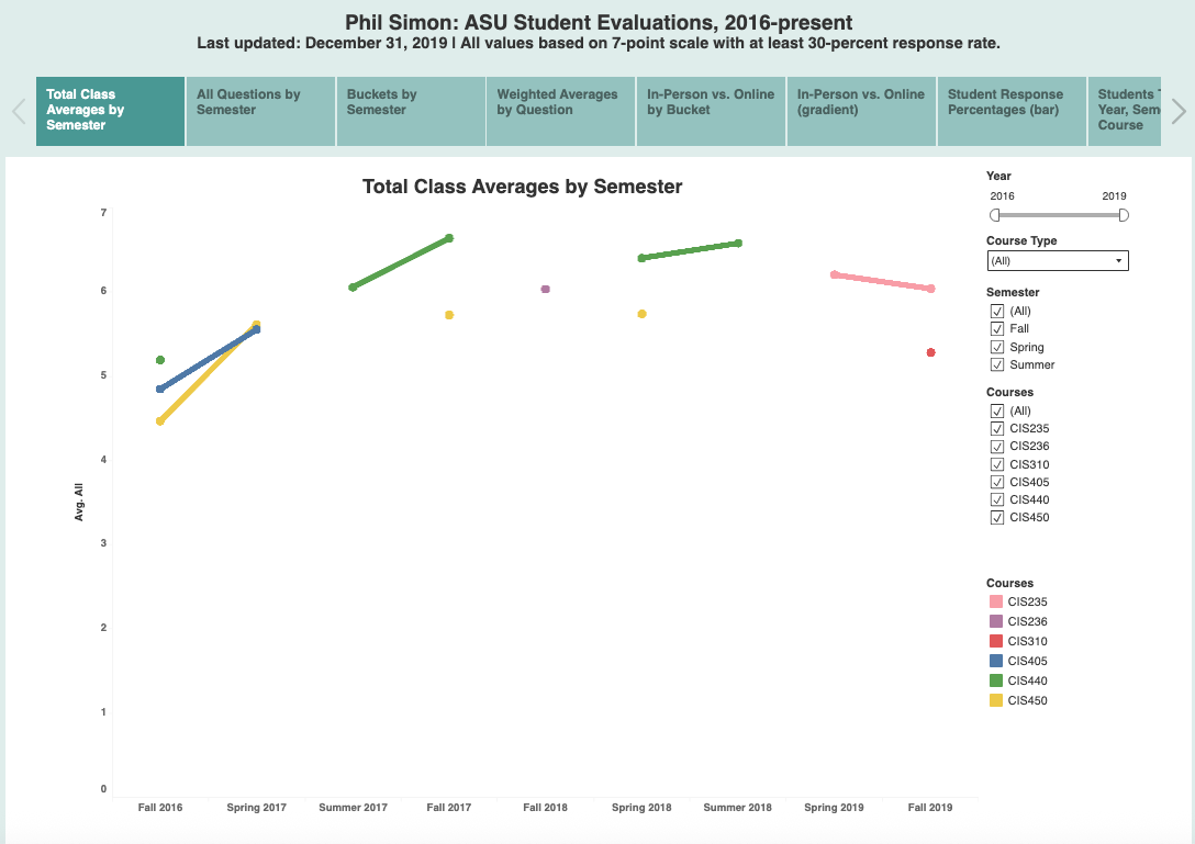
View the entire interactive Tableau workbook here. It's pretty, pretty slick.