
Disruption Visualized
An amazing and interactive graphic on how things change.

Few things tell a story like a picture, especially an interactive one. It's a key point in The Visual Organization. Static graphs don't encourage data discovery and exploration as much as those that respond to user input.
To this end, check out the neat dataviz below from The Economist:
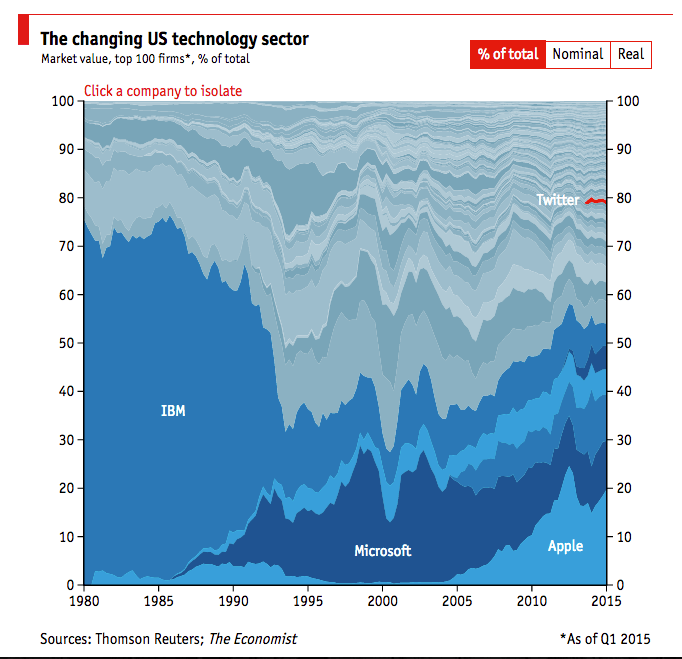
Click around and you can see how companies' market caps changed over time. You can see absolute numbers, relative numbers, and percentages.
Simon Says
Nathan Myhrvold was right after all. Apple was pretty much dead in 1997. Who would have expected such a comeback?
In short, it's chock-full of interesting data and trends. You could easily talk for hours about all of the ideas that this dataviz sparks, and that's exactly the point.


Member discussion