
How Not to Visualize Data

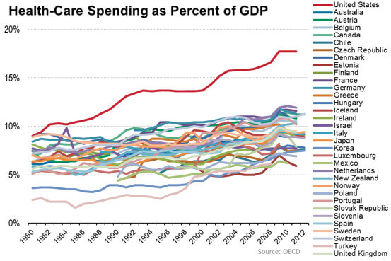
According to the Wall Street Journal, the US spends a great deal of healthcare. See for yourself:
Visual Organizations understand that less is often more.
Interesting stuff, but this is an absolutely terrible way to visualize data. The word morass comes to mind. Can you tell how Mexico has changed over time? I sure can't. I can only make out a few of the countries here. What's more, Ireland and Mexico share the same color. Which is which? Increase the y-axis and decrease the number of countries. People might actually be able to read this.
I could go on all day but what's a better way?
See how 538 effectively represents similar longitudinal data from the NBA by separating charts:

How much clearer is this information?
Simon Says
Visual Organizations understand that less is often more. Cramming everything into one chart is bound to confuse customers, users, and employees.


Member discussion