
Visualizing the 2019 Men's Wimbledon Final

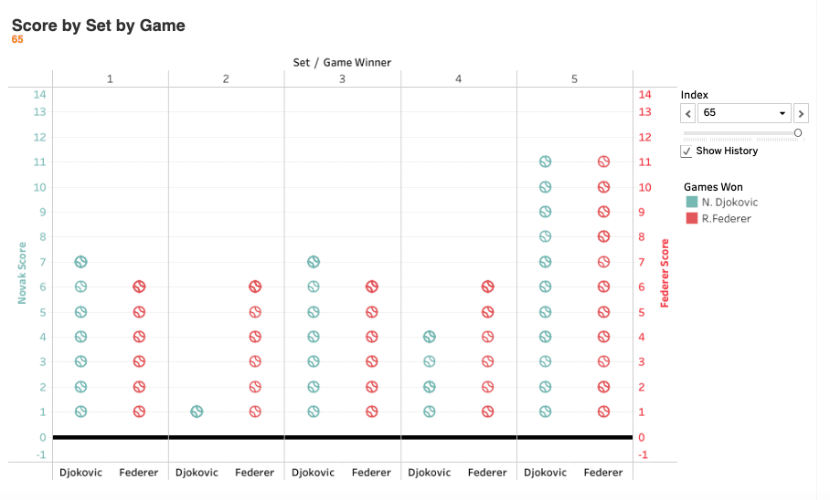
At the gym yesterday, I did my normal Wednesday workout while catching glimpses of the 46th Annual Cherry Pit Spitting Championship on ESPN The Ocho. (Yeah, that's a thing.) My eyes were one place but my mind was elsewhere. Specifically, I couldn't stop thinking about how I could represent in Tableau one of the five most exciting tennis matches I've ever seen: the 2019 Men's Final between Djokovic and Federer.
By way of background, early yesterday morning I engaged in some back-and-forth on Twitter with a few other dataviz enthusiasts. Those exchanges confirmed what I long suspected: It's just more fun to visualize sports data compared to generic business data.
Anyway, back to tennis. Here's what I came up with:
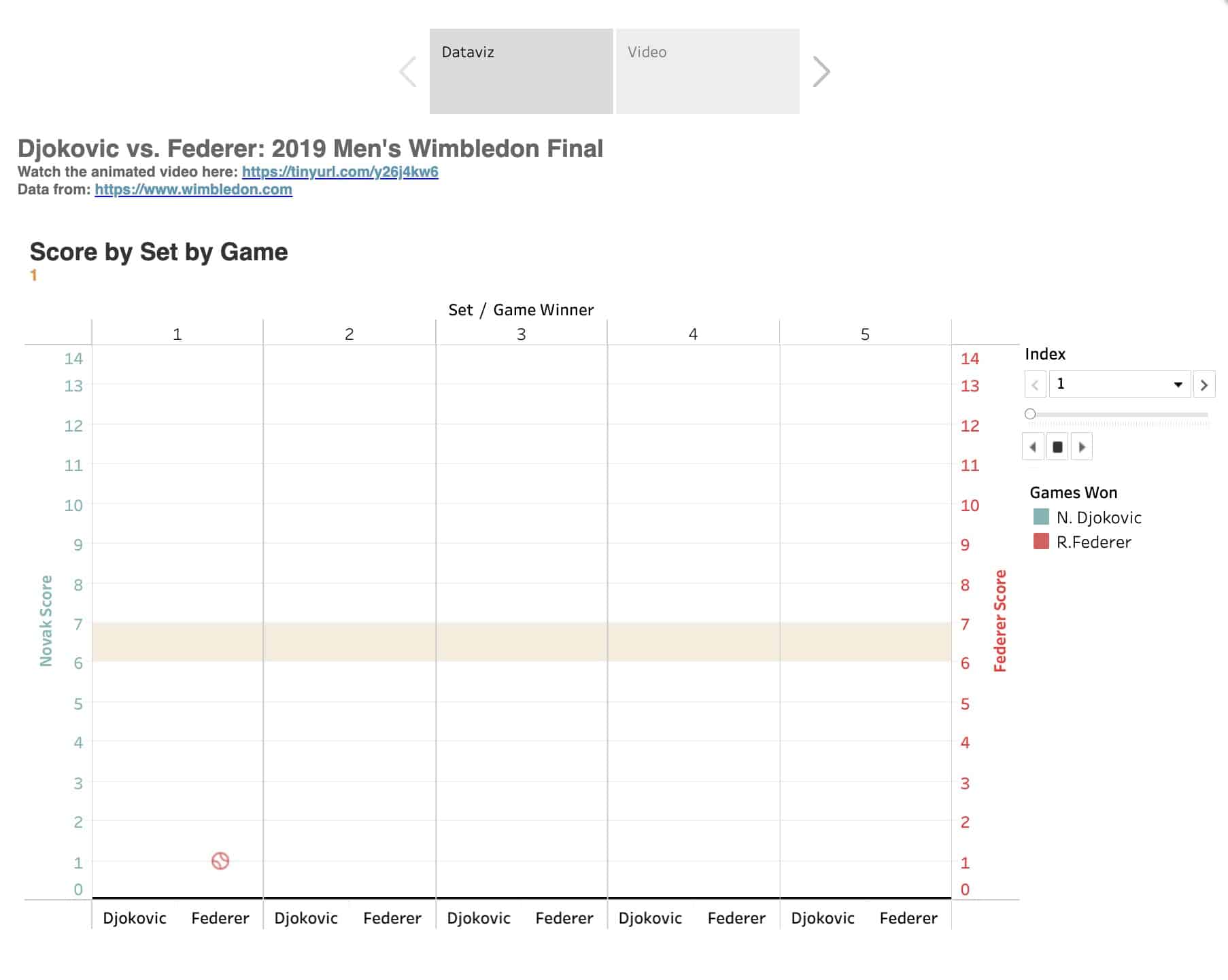
See the interactive dataviz here.
No, I wouldn't put this dataviz on the same level as this work of art. Still, doing this exactly the way that I wanted wasn't as simple as dragging and dropping. (Dual axes are beautiful things.) It took some thought and problem-solving. To be sure, I certainly didn't have the chops to do this a year ago. On a different level, animations demonstrate how tight this each set was—save for the second.
What do you think? How would you improve upon this data visualization?


Member discussion