THE NINE WINS AXIOM AWARDS

PHIL SIMON

Award-winning author, dynamic keynote speaker, trusted advisor, & workplace tech expert 

Visualizing Twitter

What did Twitter look like in 2009?
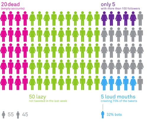
Jun | 17 | 2013


Jun | 17 | 2013
}

I’m knee-deep into research for the new book and there’s no shortage of fascinating examples of data visualizations. Here’s one of several neat infographics on Twitter from 2009.

viz

So far, the most interesting visualizations are the interactive ones. While early, it’s clear to me that there are myriad ways to make data tell a story. To paraphrase Hans Rosling, “Let the dataset change your mindset.”

Go Deeper

Outliers

Thoughts on parallels between emerging technologies from last decade and the WFH debate.

Receive my musings, news, and rants in your inbox as soon as they publish.


 Blog E Data E Big Data E Visualizing Twitter

0 Comments

Comments close 180 days after post publishes.


Blog E Data E Big Data E Visualizing Twitter

Next & Previous Posts

0 Comments