
Claude and Cardio

Getting a proper sweat going every day doesn't just keep me in shape; it keeps me sane. I religiously log my workouts via Strava and Apple Health. Those two apps provide basic information on my workouts, not penetrating analysis. (Admittedly, I'm on the free plan for each one, and Apple may enhance its Health app at some point this year.)
Data Deficiencies
At present, neither one lets me easily slice and dice my workout data. Now, I don't need to know the total number of devil's presses I've done. I would, however, like answers to specific questions. Examples include:
- What's the average number of calories I burn during my Thursday HIIT workouts? Has the number changed over the last few years?
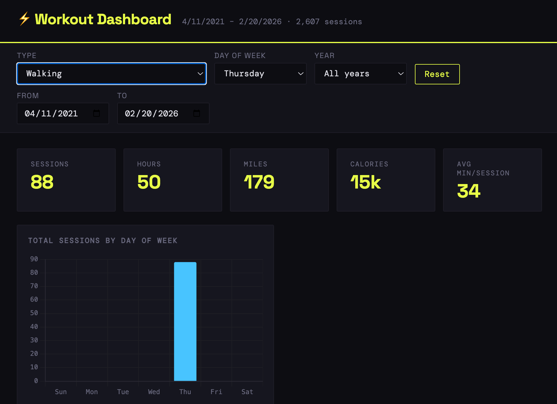
- What about my walks since last April?
- I notice the signs at my gym that contain grammatical errors and confusing sentences. Fine, but what else do I do there during a typical week?
- How much time have I spent getting my ass kicked in Heated Warrior Sculpt since I decided to torture myself?
- How do my workouts break down by time? A simple histogram would answer that question.
- How did my 2024 ankle injury affect my exercise routine?
- Do I really chill on Sundays—my scheduled active recovery?
You get the drift.
Beyond specifics, on a macro level, I can't observe general trends beyond those apps' decidedly limited views.
What to do?
Building a Better Workout Analysis Mousetrap
Fortunately, we live in an era of citizen development. Any curious soul with minimal tech chops can easily create interactive data visualizations, all without a pricey Tableau license or JavaScript background.
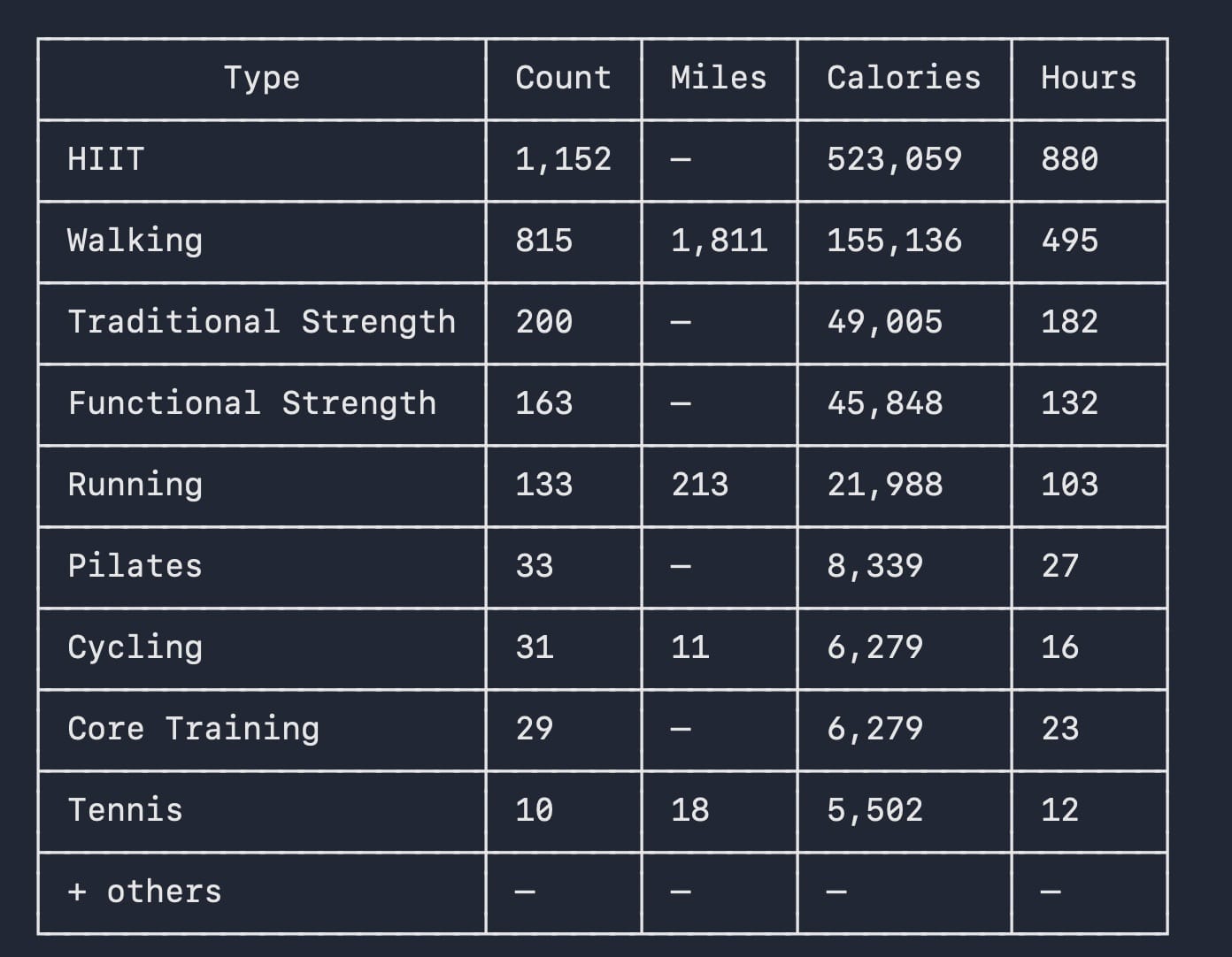
After exporting my Apple Health data to a messy XML file on my MacBook Pro, I let Claude—my favorite tool—go to work on the massive file. It created a Python script that parsed the data to a proper, much cleaner CSV format. I ran the script in Claude Code, and it provided summary stats:

Check out my 2023 book Low-Code/No-Code: Citizen Developers and the Surprising Future of Business Applications.
Interesting, but not remotely visual. Surely we could do better than this simple table. Much better. After all, it's not 1997.
It was time to take it up a notch.
Forty minutes of additional futzing in Claude and Claude Code resulted in a slick interactive dashboard:
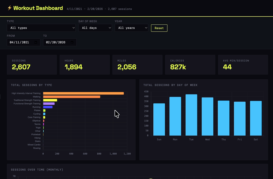
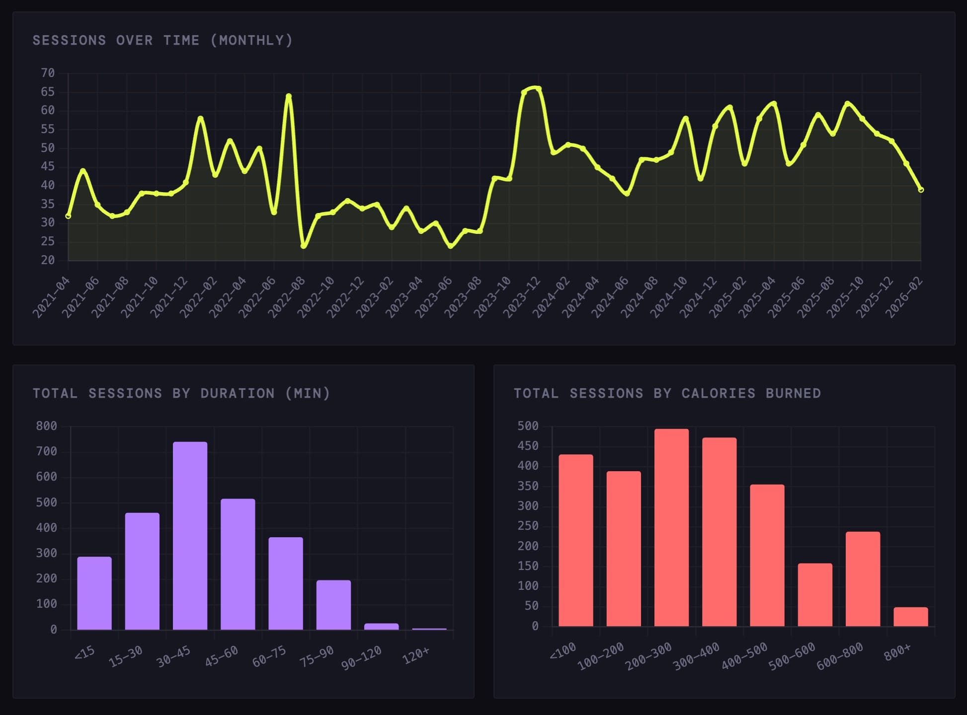
Images From Interactive Dashboard | Source: Claude Code | Click on one to enlarge it.
A chart or dashboard to answer simple queries is overkill, though. I fired up Claude and asked the dataset questions in natural language.
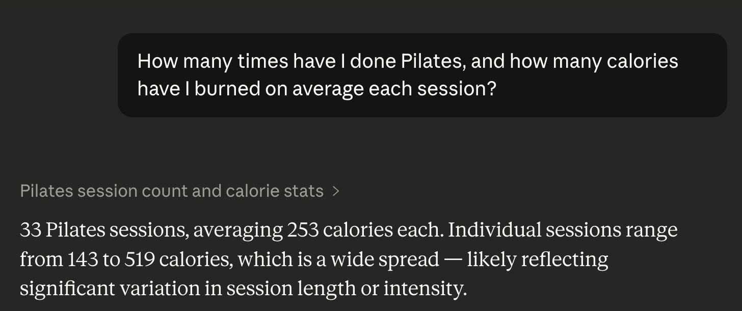
Of course, you might decide later that you want a graph after all. Ask, and ye shall receive:

Seconds later:
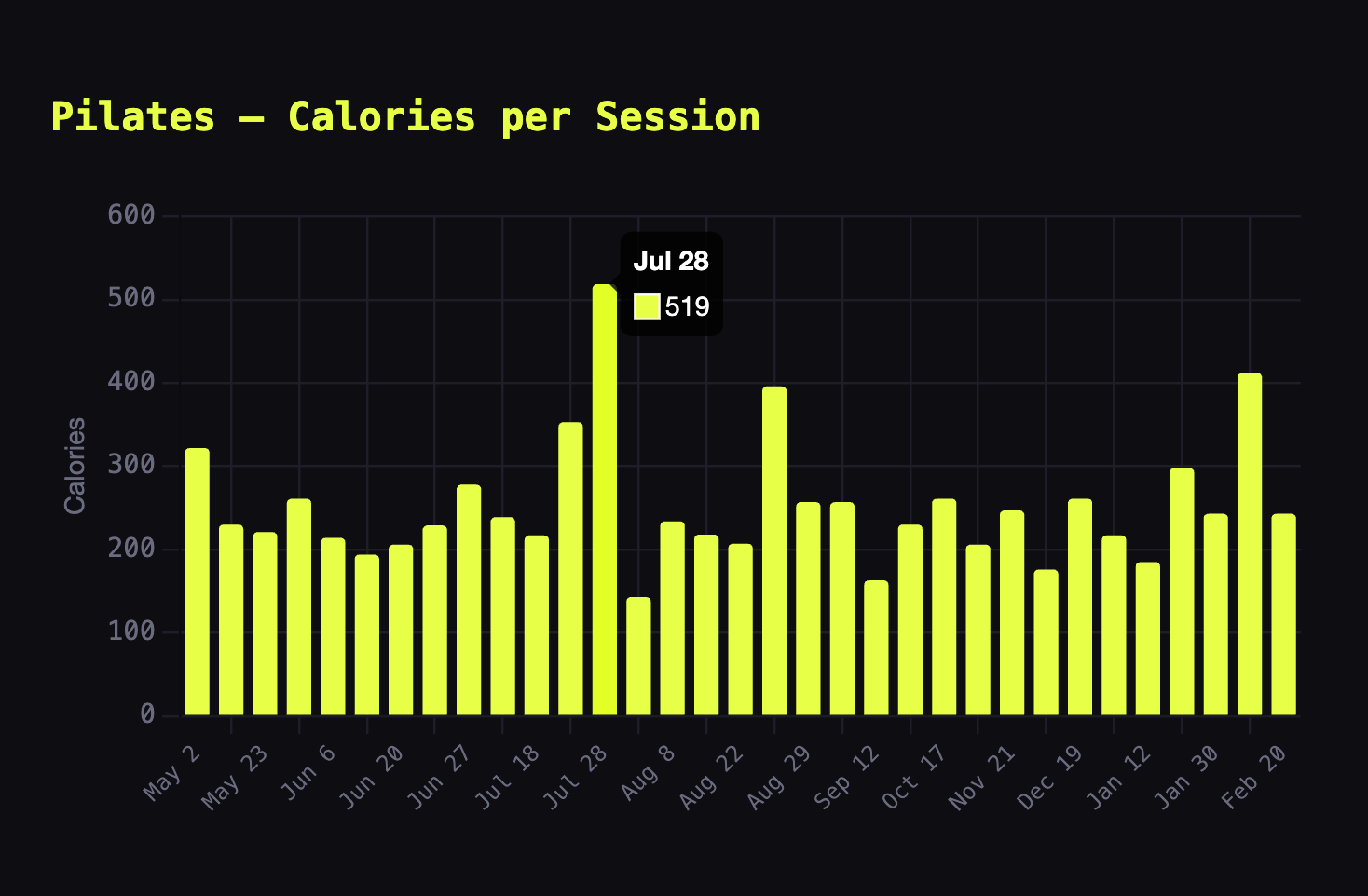
Mouse over a part of the bar chart, and the date and the number of calories burned appear.
Flexes and Limitations
My DIY workout tool represents a vast improvement over Apple Health and Strava, but it's hardly perfect.
For starters, the dashboard doesn't automatically sync workouts. In other words, it won't update after I complete a one-hour GTX class. As a workaround, I would have to either:
- Run this cumbersome ETL process each time I want to examine my most recent workout data.
- Pay for the third-party Mac app Health Auto Export or some alternative.
- Get creative with HealthKit.
In a related vein, my solution also won't alert me if my routine suddenly changes. Finally, it inexplicably fails to count the two or so miles I sprint run on a treadmill during each HIIT workout. Evidently, Apple Health infuriatingly ignores mileage data during these classes. From Claude:
Sorry, Claude, it doesn't make sense. Apple's omission flunks the logic test. (See above.) By my math, the company's decision has effectively cost me over 2,000 miles of treadmill pounding since I started wearing its watch. Call me vain if you like, but I conducted this exercise explicitly to gain better visibility into my workouts.
What a great time to be a citizen developer.

Simon Says
Despite these limitations, my little creation provides insights into my exercise history that Apple Health and Strava—apps with tens of millions of users—currently don't.1 It's not even close.
I shared the dashboard with a few of my instructor friends. They dug it and want me to show them how to use it after they kicked my ass during one of their classes this week. Along these lines, I decided to publish it on GitHub as a public repo. (My friend and fellow Claude nut Brad Feld gave me the nudge I needed.) Steal it and fork away. Setting it up yourself is pretty straightforward.
If I can vibe code something so useful in a short period, so can you.
What are you waiting for?
Footnotes
- At least to my knowledge and at the time of my writing. ↩


Member discussion