How Dataviz Can Manifest a Tale of Two Sports

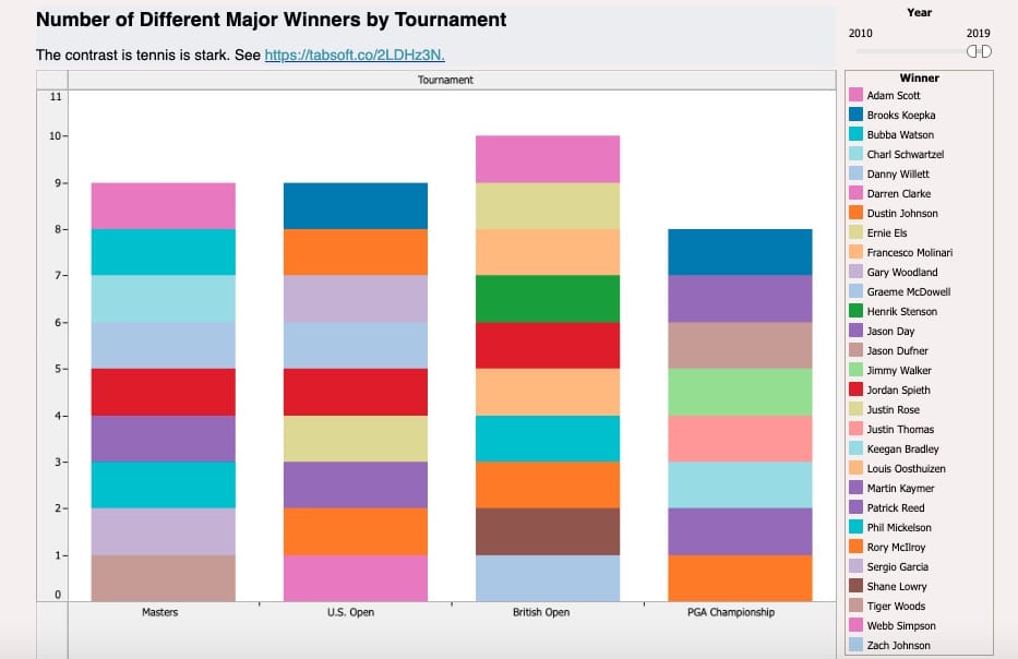
Shane Lowry ran away with the British Open today—his first major championship. In a way, a first-timer winning on Sunday is nothing new in the world of golf. For the last ten years, it seems that repeat champions have been the exception and not the rule. We are far from Tiger Woods' heyday.
Using Tableau, it wasn't hard to confirm my suspicion.

Yes, 29 different men have won major championships since 2009. It's an amazing number. (See the entire interactive dataviz yourself here.)
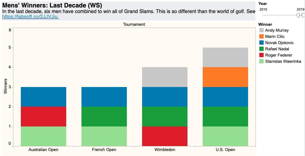
Contrast that with tennis. The era of the Big Three is alive and well. Case in point: Only six different men have won major tournaments in the same time period.

Again, you can view the entire tennis dataviz online here.

Simon Says: Tableau makes data discovery fun.
I have nothing against SQL statements and Excel, but I've never had as much fun visualizing data as I have with Tableau. Asking and answering questions is remarkably intuitive and the application's formulas follow contemporary programming conventions.


Member discussion