
Proper Tools Optional: The AI Effect

In 2014, Wiley published The Visual Organization. In a nutshell, my sixth book makes the case for ditching static line and bar charts. By embracing interactive data visualizations, organizations stand to reap enormous benefits. Specifically, non-technical users can ask and answer thorny business questions. No longer would they need to incessantly pester their IT departments and developers for data and reports. To quote Walter White, “Everybody wins.”
I never expected the book to attain bestseller status, but its message clearly resonated with large software vendors. Tableau—now part of Salesforce—purchased 750 copies to give to employees and customers. My writing client at the time SAS bought twice as many, and the book quickly earned out. Netflix and plenty of other prominent organizations hosted me on my book tour.
More than a decade later, the world of enterprise tech looks a little different. Blame AI. This begs the question: does my book's central thesis still hold?
Revisiting Workplace Tech a Decade Later
In short, yes—with one big caveat. Non-techies no longer need Tableau, PowerBI, or other best-in-class dataviz tools to create the very interactive dashboards I advocate in the book. Claude, ChatGPT, Gemini, and their ilk are more than up to the task.
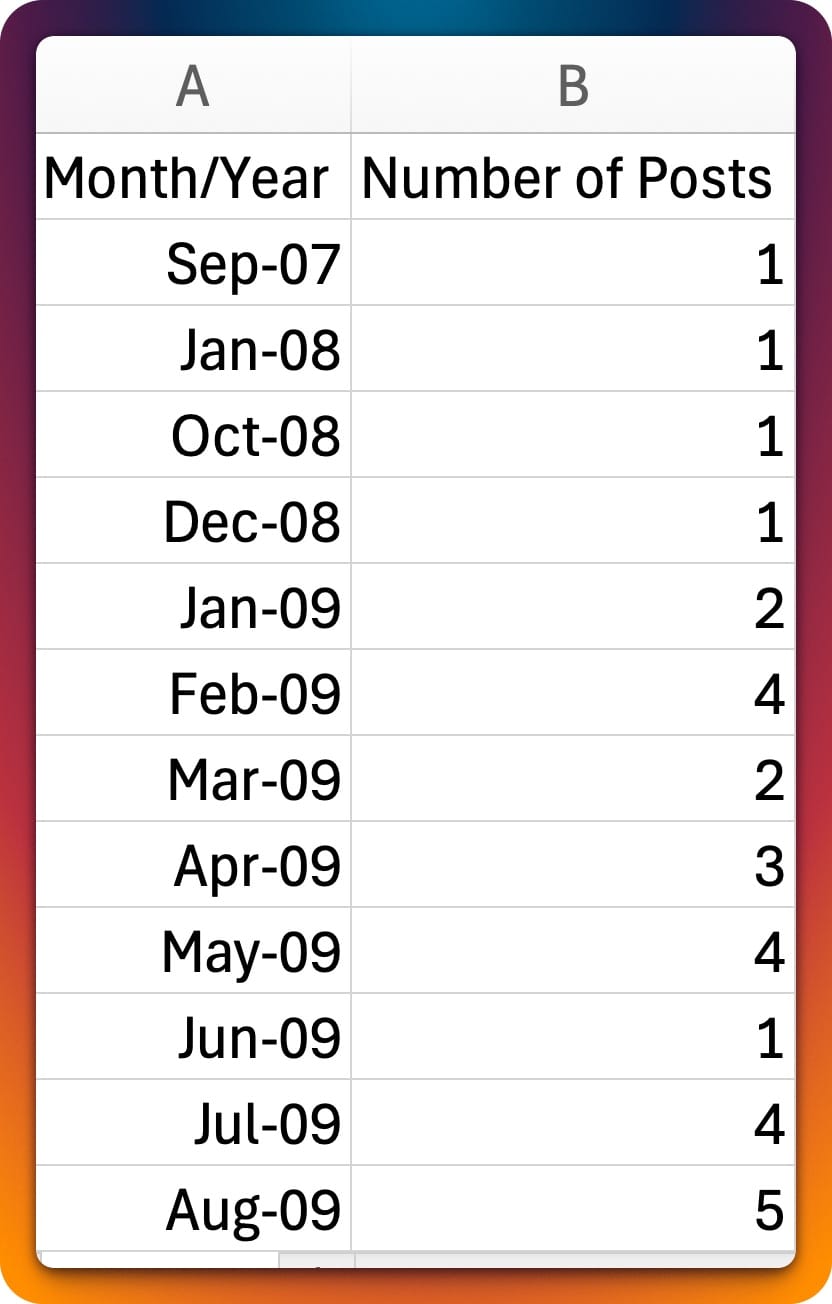
Case in point: I asked Claude to write a script that would tell me how many posts I've published on my site by month since 2007. It dutifully complied, and it didn't take long for my answer to appear.
Citizen developers possess a more diverse toolbox than ever.
Here's a truncated version of Claude's output.
Armed with the data, I then asked it to create the following interactive visualization. Claude used an insanely powerful ChartJS to create one that lets anyone filter posts based on custom date ranges. What's more, it added the summary stats at the top on its own.
What I Didn't Need
Claude generated a solid prototype within five minutes. The final product took maybe 45 minutes to complete because I decided to do a few rounds of tweaking. This begs the question: What didn't I need?
- Anything close to detailed JavaScript knowledge.
- A pricey license for a proper dataviz tool.
- A ton of time.
Four years ago, building this data visualization on my own would have taken me weeks to complete.

Simon Says
To be sure, Tableau Zen Masters and other dataviz beasts aren't going the way of travel agents and typists this year. (As of this writing, LinkedIn lists 5,000 available jobs for certified Tableau professionals alone.)
Unlike when I wrote my book, though, creating a truly useful visualization today no longer necessitates knowing exactly how to make the sausage. Similar parallels exist in the database world with Notion and Airtable. You can make the same case for graphic design with Nano Banana. I could go on, but you get the point.
Brass tacks: citizen developers possess a more diverse toolbox than ever. Expect that trend to intensify in 2026 and beyond. In five years, maybe we'll see the tech equivalent of video once again killing the radio star.


Member discussion