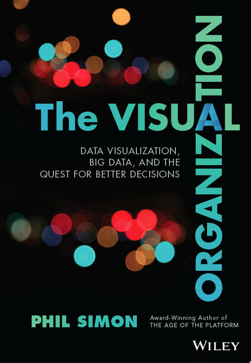
The manuscript for The Visual Organization: Data Visualization, Big Data, and the Quest for Better Decisions is now in my editor’s hands. We’re about to start editing, and the book should be out a month earlier than expected (Feb, 2014).
Here are just a few observations as my manuscript is polished into a book.
At least for me, connecting with so many talented and smart folks is one of the biggest benefit of writing books. I often learn by osmosis, and having my theories validated and refined by practitioners only gives me more confidence as a writer.
You need not be a programmer, statistician, or data scientist to get started with dataviz.
As always, the research process has been very instructive. I have learned a great deal about how people and organizations use contemporary data visualization tools and new sources of data to ask better questions and make better decisions. It’s obvious to me that there is no one right way to represent data in a visual manner. It is equally obvious that people can do a great deal more with interactive tools then they can with static ones. The book even posits a model on Visual Organizations of which I’m pretty proud.
There has been a veritable explosion of data visualization applications over the last five to ten years, and more are being developed every day. Yes, there are oodles of options simple Microsoft Excel charts, dashboards, and even traditional business intelligence tools. And there’s just no excuse for not experimenting with them. Many of the applications out there are entirely intuitive; you need not be a programmer, statistician, or data scientist to get started. You just need to be curious.
Perhaps the most astonishing finding for me has been the extent to which Netflix visualizes data. You can read more about it when the book comes out, but it’s almost easier to list the types of the data that Netflix isn’t tracking than the opposite.

 PHIL SIMON


0 Comments