Google Glass: Enabling Powerful Sports Visualizations?

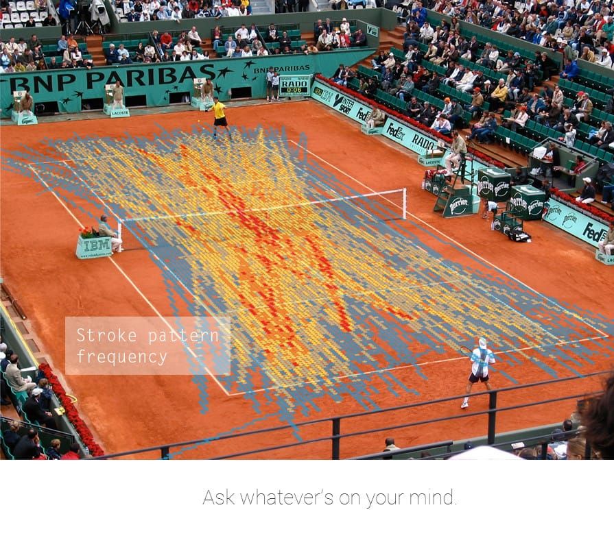
My friends know that I'm a big tennis fan, and I love technology as well. The jury is still out on Google Glass, but cool visualizations of tennis data like the one below may well be coming. The chart below is on stroke pattern frequency during a French Open match.

I used to look at relatively simple charts and graphs with a pretty ho-hum attitude. They got the job done, but they weren't terribly exciting. At this point in the writing and researching process for The Visual Organization, I'm just amazed. Yes, I am starting to ask myself, What can't we visualize? How are we improving upon prosaic staples? It's evident to me that the tools today are orders of magnitude more powerful and just plain cooler than their counterparts of the 1990s.
The tools today are orders of magnitude more powerful than their counterparts of the 1990s.
Simon Says
Yes, we are living in an era of Big Data. Fortunately, we have developed the tools to understand this new world.
Are you stuck in the Excel chart days?


Member discussion