THE NINE IS OUT NOW

Phil Simon

THE WORLD’S LEADING INDEPENDENT WORKPLACE COLLABORATION & TECH EXPERT

Visualizing My Teaching Schedule

Sometimes Gantt charts actually make sense.
Aug | 6 | 2019

Aug | 6 | 2019
}

For years I’ve railed against Gantt charts.1 As someone who has spent more than a decade helping organizations implement massive systems, I can tell you that they don’t remotely represent the timeline of launching a new ERP or CRM application. I can recall meetings during which I laughed at precise estimates a year or more out. Yep, I’ve seen 800-line project plans that made little sense. How do you know that testing the new system is going to take exactly 34 days?

Yet, in the right context, interactive Gantt charts can clearly display what has happened in the past. Here’s an example of my teaching schedule:

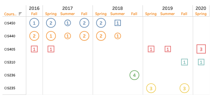
As each dataviz above illustrates, I teach very different types of courses than I did when I started at ASU three years ago. Gone are the 400-level capstone courses—at least for now. In their stead, I now largely teach survey courses designed to expose students to a wide variety of topics. 

Simon Says: No one forces us to create confusing visuals.

I think of dataviz programs such as Tableau like e-mail and PowerPoint. The users—not the applications—confuse us. Adding interactivity in the form of filters helps users easily see what they want to see. They can zoom in and out as they like.

Feedback

What say you?

Footnotes

  1. It’s a common refrain.

Receive my musings, news, and rants in your inbox as soon as they publish.


Blog E Higher Education E Visualizing My Teaching Schedule

Related Posts

From Big to Small

Layoffs are all the rage these days. Microsoft, Zoom, Amazon, Meta, and Salesforce are just some of the companies that have let go of thousands of employees. Yet the labor market remains white hot. Unemployment is 3.4 percent. It's a question that I consider in The...

The Reimagining Collaboration Keynote Visualized

eaders of this site know that I love dataviz, a good visual, and collaboration. Last week, I gave the keynote at a virtual WDHB event on Reimagining Collaboration. The good folks there turned my talk into the following graphic:Click to embiggen....

The Teaching Shackles Are Off. It Feels Amazing.

ew books have stuck with me a decade after I have read them. Drive: The Surprising Truth About What Motivates Us by Dan Pink is one of them. Through research and compelling stories, he adroitly describes how autonomy, mastery, and purpose serve as...

On Hybrid Work, Book Figures, and da Vinci

Confession of a Design Snob he pandemic has changed many things. Sadly and as a few recent webinars have reminded me, the design sensibility of many speakers and writers isn't one of them. PowerPoint and Visio monstrosities remain prevalent in...

0 Comments

Submit a Comment

Your email address will not be published. Required fields are marked *


Blog E Higher Education E Visualizing My Teaching Schedule

Next & Previous Posts

Related Posts

From Big to Small

Layoffs are all the rage these days. Microsoft, Zoom, Amazon, Meta, and Salesforce are just some of the companies that have let go of thousands of employees. Yet the labor market remains white hot. Unemployment is 3.4 percent. It's a question that I consider in The...

The Reimagining Collaboration Keynote Visualized

eaders of this site know that I love dataviz, a good visual, and collaboration. Last week, I gave the keynote at a virtual WDHB event on Reimagining Collaboration. The good folks there turned my talk into the following graphic:Click to embiggen....

The Teaching Shackles Are Off. It Feels Amazing.

ew books have stuck with me a decade after I have read them. Drive: The Surprising Truth About What Motivates Us by Dan Pink is one of them. Through research and compelling stories, he adroitly describes how autonomy, mastery, and purpose serve as...

On Hybrid Work, Book Figures, and da Vinci

Confession of a Design Snob he pandemic has changed many things. Sadly and as a few recent webinars have reminded me, the design sensibility of many speakers and writers isn't one of them. PowerPoint and Visio monstrosities remain prevalent in...

0 Comments

Submit a Comment

Your email address will not be published. Required fields are marked *