 PHIL SIMON
It’s been about two years since the publication of The Visual Organization. In that time, the importance of data and dataviz have only increased. Ditto for the need of nearly all employees to interact with data on a regular basis. Filling out report requests and submitting them to the IT department seems to 1998. Smart organizations understand this and are acting accordingly. They are empowering everyday employees with powerful and interactive tools designed to let them fish for themselves.
The Benefits of Interactivity
And the same holds true on the consumer side. If I want to find out more about the subject of a story, why do I always need to do a separate Google search? No, even a #longreads article cannot possible answer every related question that readers may have on a topic, but riddle me this:
- Why not add interactive and visual elements to articles and blog posts?
- Why not keep readers on your site longer?
- Why always send them to third-party sites via backlinks?
- Why not anticipate some of the questions they might have and provide answers?
Interactive data visualizations can add dimensions to your writing that static charts and infographics simply cannot.
It turns out that it’s not terribly hard to make your content both more informative and stickier. Tools such as Tableau require only the ability to cut and paste code. As a result, content creators to spice up content with really interesting and dynamic elements. For instance, let’s say that you wanted to see a dataviz on the discography of Foo Fighters’ members.1 Or what if you wanted to see which actors’ films have grossed the most money?
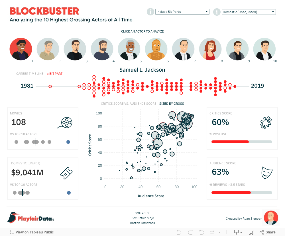
Props to PlayFair Data for this work of art.
Simon Says: Why not make your content more visually compelling?
Never has it been easier and more important to make content visually compelling and informative—something that more and more journalists are learning. It’s easy to insert even interactive sports statistics. Sure, bad writing with unnecessary tchotchkes and graphics is still bad writing. When appropriate, though, interactive data visualizations can add dimensions to your writing and speaking that static charts and infographics simply cannot. Put differently, they make boring posts come alive.


0 Comments