 I’m a pretty fast writer and believe strongly that it’s essential to get it down before you get it right, to quote Neil Peart. There’s one part, though, that I typically slave over: the jacket copy, a roughly 450-word encapsulation of the entire book. If it sucks, then it’s unlikely that anyone will want to plunk down $25 for the whole thing.
Jacket copy should include stories. Hitting people over the head with technical terms in generally isn’t wise, much less in the limited space on a book jacket. Good copy should mix examples with the larger purpose of the book.
Let me know what you think in the comments. I am curious to read others’ opinions.
Jacket Copy
Are you predisposed to movies with black jacket covers? When it comes to TV shows, do you have a natural affinity for orange? Does your five-start rating for Arrested Development mean that you are likely to enjoy Orange Is the New Black? Are certain colors more popular during certain times of the year with certain audiences? What’s your ideal hue?
If you’re a Netflix customer, then the company knows the answers to these questions—and a great deal more—for you and for each of its 30 million streaming subscribers. The company’s renowned video-recommendation algorithm integrates an astonishing array of data sources. Each one increases Netflix’s knowledge on individual and family user habits and preferences.
Netflix is hardly alone in its innovative use of new dataviz technologies.
Relatively few people are aware, however, that the vaunted Netflix algorithm is only partly responsible for the company’s massive success. Behind the scenes, many pockets of the organization rely heavily upon a slew of powerful, custom-built data visualization applications. Equipped with these tools, Netflix employees are discovering nascent trends, diagnosing technical issues, and unearthing obscure yet extraordinarily valuable customer insights.
And Netflix is hardly alone in its innovative use of new dataviz technologies. Employees at Autodesk use a remarkable and interactive tool that visualizes current and historical employee movement. From this, they can identify potential management issues and see what a corporate reorg really looks like. Through cutting-edge dataviz, startup Wedgies instantly serves up real-time poll results while monitoring poll traction and site issues. The University of Texas is bringing a visual type of transparency to academia. It makes unprecedented amounts and sources of institutional data available on its website. Anyone with the desire and an Internet connection can slice and dice UT data in myriad ways. And then there’s eBay. Powerful data-discovery tools allow employees to effectively “see” what ebay.com would look like as a brick-and-mortar store.
The era of Big Data as arrived but, on many levels, most organizations are woefully unprepared. Far too many enterprises erroneously believe and act like nothing has really changed. As such, they continue to depend exclusively on reporting stalwarts like Microsoft Excel, static dashboards, basic query applications, and even traditional business intelligence tools. And they are missing out on tremendous opportunities.
Amidst all of the hype and confusion surrounding Big Data, though, a new type of enterprise is emerging: The Visual Organization. A relative handful of organizations has realized that today’s ever-increasing data streams, volumes, and velocity require new applications. In turn, these new tools promote a different mind-set—one based upon data discovery and exploration, not conventional enterprise “reporting.”
In The Visual Organization, award-winning author, keynote speaker, and recognized technology expert Phil Simon demonstrates how progressive enterprises have turned traditional dataviz on its head. In their stead, they are embracing new, interactive, and more robust tools that help locate the signals in the noise that is Big Data. As a result, these enterprises are asking better questions and making better business decisions.
Rife with real-world examples and practical advice, The Visual Organization is a full-color tour de force. Simon deftly explains how organizations can do more than just survive the data deluge; they can thrive in it. It is required reading for executives, professionals, and others interested in unleashing the true power of their data.

 PHIL SIMON


This jacket copy is not good. It is confusing and doesn’t get to the point nor offer a benefit to the reader if they were to buy the book.
Working with what you wrote, you should cut the first two paragraphs and condense them into the first clause of the first sentence in the third paragraph. The second to last paragraph should be moved to the first and ended with the benefit. There is a bunch of off-putting sales cliches that should be proven, or else dropped. “A tour de force…Required reading” Really? Why? Prove the benefit. I am interested in the topic, but don’t know why I would want to read this book.
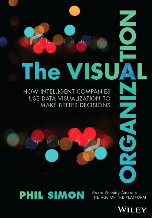
Also, the book cover is not good. You worked so hard on a book about the value of conveying visual information, yet the cover art is mediocre and conveys…nothing. Take the time to find something–whether from the book itself or reference a Tufte book to get something visual that provides an “aha” moment.
My point is not to be negative or criticize, if you want more specific actionable feedback or suggestions, just email me and I would be happy to help. If you want to delete this comment, I won’t be offended.
Thanks for the feedback. I might tweak the text but I respectfully disagree with you on the cover.
Maybe I am just dense, but I don’t know what the cover is trying to communicate.
Anyway, best of luck with the book.
The blurry dots are becoming clearer. It’s a metaphor for what dataviz can do.